First,
Open the RAW on to your Photoshop.
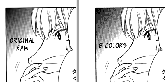
This is an example of a Really good RAW Scans, you can even just remove the text and typeset it, and it'll still somehow still a proper enough page for release.
Duplicate your current Background Layer. To Show Layer Pane, Window > Layer
Then Right Click at the active layer > Duplicate Layer
You could also Duplicate Active Layer by pressing Ctrl + J.
Levels
There should be a button like this in the bottom of your Layer Pane

Click them and choose Levels...
Leveling are quite easy, just slide the black slider (the left on) to where the starting peak is.
You just need to slide the slider to left side of the base of the peak, Like in the image below
You don't need it to be really black right now, as long the area which supposed to be white is white.
Don't play with the middle slider, unless you know what you're doing, it'll cause jagged lines, if you move it too much (it'll move automatically as you slide the 2 other slider, but if you slide it by yourself, you might get jagged lines)
Brightness
Click Adjusment button on the layer pane again and select Brightness and Contrast and set it to make it a little bit blacker by using Brightness Slider, you don't need the Contrast, cause you're playing with black and white images, it doesn't do anything much.
Resizing
Now Let resize your page, Open it via Image > Image Size, or by pressing (Alt + Ctrl + I). Usually different scans group have different size standard, Most scans uses with 800px Width, and let Constrain Proportion decide the height, as long it isn't too far from 1200px. Some also use Height:1200px as standard, and left the width.
Makesure Constrain Proportions is ticked.
For Web Release (not for printing) 72 PPI is already good.
Mode
Now Select back the layer you Duplicate at first step, The RAW scan. Change it Mode to RGB. If you're not using Topaz (denoise and clean), change it to Grayscale and proceed to Removing text, you can skip this step
After you select RGB Color this option will appear, pick Don't Flatten. Make sure you're selecting the RAW Duplicate Layer.
Blur
After reading somewhere in a guide on how to clean Manga, and after testing it myself, Topaz Denoise will work better when used on blurred image, somehow it's true, it'll maintain the detail better, all you need to do is Re-Sharp it later.
Access Blur via Filter>Blur<Blur
Denoise-ing
This is a trial and Error step, I can't teach you much, you'll need to player by yourself on this, For RAW that are already have good quality as well not too much Noise, the First Preset "RAW_Normal" Should Be enough. You can see that blurred grey shadow in the background, it only takes RAW_Normal preset to make them, this is a very good RAW Scans.
I'll make this tutorial later for Denoising, I'm using the old version of Topaz Denoise, it should around version 5 right now.
Topaz Clean (Optional)
This is an unnecessary step if you have a good RAW, Unless you want to make them to have really smooth texture, you can set it with Topaz Clean, or even give more texture, you can use deGrunge.
If you had a not good RAW, and after Denoising, it still have lots of grain, use this.
Sharpening
Remember when we blurred the image earlier, although you can really sees it right now, after you re sharpen the image, it'll look better, more crisp.
Open Smart sharpen via
Filter > Sharpen > Smart Sharpen
Use this setting below
Amount : set this according to the result of previous process (blurring, denoising and cleaning) tick the Preview check box.
Radius: 1.5px, you can higher this also, just trial and error, which look better.
Remove Gaussian Blur.
More Accurate : you can tick this if you want even more sharp picture.
Removing Texts
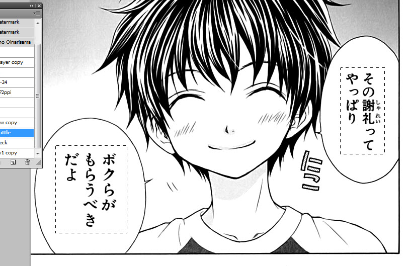
Create a blank layer and rename it to Text, or something to tell you it's the layer where it block the text.
Now using Marquee tool, select the texts, which are box shaped usually, cause Japanese manga written up to down.
After the first selection, hold Shift and select the text on the other Balloon text.
You can zoom the image you select small texts like those dots.
Fill
Now fill the Areas you have selected, and make sure you are on a Blank Layer. Go to Edit > Fill, you can also press Shift+F5. Select Foreground colour/Background Color, make sure you are on default black and white color picker and make sure you choose the one with white (e.g you have with on foreground color, so choose it). Before you go to Fill you can press D to change color picker to default (B&W)
Why on a blank layer ? so you can undo things if you make a mistake, this is the safest way. You left your Cleaned Picture untouched as possible.
Removing SFX
Create another blank layer and rename it to SFX or something, use brush and set the foreground color to white, and then you remove the SFX.
If it's over a picture/ grey background read the next part.
What about the text/sfx that are over a picture/background ?
There's no easy way to explain this, you can redraw them after you erase them, I mostly use the Stamp tool (forgot what it called, it look like a stamp) To do this, it's impossible on a new blank layer. So what I usually do is duplicate the Layer 1 again, and select the area that I will work to redraw, then Inverse Selection and then delete it, so it became transparent, and only the redraw part exist. you might want to redraw first before deleting the other area.
If it's a white background but over a line > Use brush (white color) to remove the SFX/TEXT, then redraw it using Stamp tool (S)
- If it's over a grey/gradient background, use the Stamp Tool directly, but remember to parallel the direction of the gradient, or else it might be noticeable. Heal tool works better on redrawing on a gradient area, but it's quite different to use them
Actions
If you clean regularly, you might want to record what you do, so you only need to play the record, so it'll automatically do things for you. Note that there are some parts that better to be manually handled such as Levels.
Burning
Burning is the process to make black more black. This part isn't really necessary, if you wish to make something looks darker use this tool. e.g lines that look light, and it should be darker, use this.
Use this settings to darken details and lines or such.
Saving
If your scans group ask for PSD files to give to the next job (Typesetter), you just need to Ctrl+S or
File>SaveAs
Find out what the next people who uses the PSD (i.e Typesetter) have what version of Photoshop, sometimes the latest version PSD won't work in older version. So you can maximize the files.
If you need to export them to Picture format such As PNG or JPEGs
Use
File>Save for Web and Devices...
For B&W pages, you can set the settings to PNG-8 and set it like the picture below. Then click the button on the right of the Preset [Unnamed] and choose Save Preset, save it to Manga.
Colors should be change according to the end result of your cleaning, sometimes 17 is enough already (really high contrast cleaning, mostly only black or whites) if you have lot of grays, use 64 or more. Each step you pick, if the file size stop increasing much, it mean that it's the optimum colors option.
for example, from 17 colors to 32 you have filesize from 23KB to 100KB (lot's of increase), from 32 to 64 you have 100KB to 234KB, still big, but from 64 to 128 it's only increase frmo 234Kb to 240KB. It mean 64 colors is the choice, as adding more colors, but not all are used in the picture, that's why files size increase by a bit.
But this is the job that's need a human eye, you must see the differents in adding and Subtracting color will effect on the picture. you should see the grey gradient areas, this is the most critical part when you lower the color.
For color pages, use JPEG or PNG-24 Settings. if you want to use PNG-8 you can try, but set Dither to 0%
Learn Quick Keys also to save time in Cleaning. The Most used tools Quick Keys List
here
End of This Tutorial